
This solution is a basic example of a simple dashboard for Executives and Project Managers in regards to Projects being worked on within the organization. Executives can look at Portfolio level detail or look at the details of any specific project. Project Managers can look at their projects, or depending on security, can view other projects as well. The first page answers the question of many stakeholders – how far along we are on any given schedule or for the portfolio? And, are we on track on our projects Key Performance Indicators (Milestones, Finish Variance and Deadline Variance)? The second and third pages show costing in a visual format. These tabs answer costing Key Performance Indicators like Earned at Completion and Variance at Completion. The fourth page shows how many Issues and Risks are in the portfolio overall.
Executive Overview
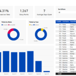
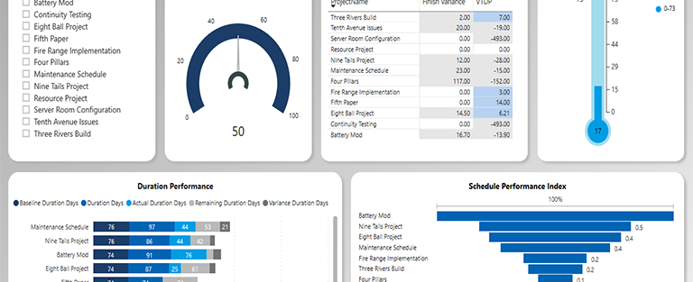
Executives and Upper Management receive a lot of information in a lot of ways. By visually giving them the status of the current portfolio of projects and displaying if it is on time or not to the deadline date makes it easy for them to know where they should concentrate their time and energy. That is what the status page shows – the percentage complete of each project in the portfolio based on the project status that is selected. In the middle top of the screen is the SPI KPI for each project. And, on the right side, the number of milestones completed overall and by project (when selected). The bottom left of the screen has a scrolling set of the Duration KPI’s.
The second and third tabs are a key set of KPI’s for most organizations – the costs and related information. The Costs Status tab has the rotating Cost Metrics and the EAC and VAC KPI’s on the bottom of the screen. The top of the screen has the CPI, Budget Percent Spent and Phase Cost metrics. The Phase Cost data screen has come card data showing the overall numbers and a matrix visual that allows drill down to each phase by schedule while the top part of the screen gives a visualization of that same information.
In many situations, EPM Strategy creates the report so that it is drillable and then the Management Team can look and see what task(s) are causing the project to go late if they so desire. Or, this report can link to another report that gives more detailed information for each individual project that can display the task(s) that are causing the dates to move for a project. In this example, we are not a slicer but in larger organizations we may also use Departments, Project Managers, Locations or some combination of those and other important differentiators that an organization may use.
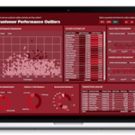
The last page represents a common request by Executives and Upper Management as well – “How many Issues or Risks are there on these projects?” It may be that before drilling down on the information on the first page, the Issues and Risks can be reviewed to determine if there is an obvious cause of the percentage complete or variance shown on the first page. For example, an issue may be on a project for a task where the organization is waiting for some external input. By drilling down on the issues for a project it may be that the Management Team doesn’t have to start asking Project Managers or other stakeholders the reasoning for the information from the first page. This is another potential time saver as the reasoning behind the data can be sometimes easily seen by drilling down on the Issues (or Risks) for a specific project.