
The most popular analogy used to describe a data dashboard is a car’s dashboard, which gives instant access to critical information. An automobile dashboard allows the driver to view the various instruments to monitor the many functions of the car and engine. In a car, the instruments will instantly tell you the status of fuel level, tire pressures, miles per hour and even a flashing “check engine” light that notifies the driver of a serious issue with the engine.
School districts are quite similar in that there are a multitude of moving parts in your school district that can impact your overall outcomes and performance. A quality data dashboard will aggregate these events with data visualizations that are easy to understand and hopefully drive action.
So, does your school district need a data dashboard? The short answer is an unequivocal yes! In this article, we will examine the nature and scope of data dashboards and why it’s crucial that school districts implement a data dashboard.
History of Data Dashboards
In the late 1990s, Microsoft promoted a concept known as the Digital Nervous System, and “digital dashboards” were described as being one leg of that concept. In 2000, a data-driven digital dashboard was a concept created to display information in a more user-friendly, visually pleasing manner. The early genesis was Kaplan’s and Norton’s Balanced Scorecard. The balanced scorecard is a strategy performance management tool—a semi-standard structured report, that can be used by managers to keep track of the execution of activities by the staff within their control and to monitor the consequences arising from these actions.
During these early years, the idea seemed ahead of its time. Most districts did not have the hardware capabilities to achieve instant always-on data feeds, and schools had data in silos or did not have much data at all. The initial dashboards were basically toolsets for developers and districts did not possess the expertise to exploit these tools. The toolsets quickly became dashboard development environments. These applications were meant to help deploy dashboards inside of companies and school districts with little IT help. The ideas were great, but the execution lackluster.
Also, early dashboards lacked “drilldown.” Many of the first and even second-generation dashboard solutions couldn’t handle multiple drilldowns to more detailed information; returning a user to where they started was often a confusing endeavor. Around 2007, district data users were increasing in sophistication as hardware and network performance were improving. It seemed everyone had jumped on the bandwagon and the most important development of this time period was a broad understanding of the need for business intelligence. Dashboards may have been the lens to see into the data, but business intelligence was the key to make sense of all the data.
Since 2012, companies have focused on business intelligence and sorting all the information into meaningful chunks. Dashboards were being used for all types of things that no longer fit into the original use cases. Issues began to surface because demand was increasing to use dashboards for everything, including replacing transactional systems by posting data back to the source.
Dashboards appear to be coming into balance with the overall technology needs of the school district. The applications continue to mature. Most dashboard app developers have jumped into mobility; there is also a mature offering of dashboard tools schools can purchase and deploy. District leaders are finally understanding that demanding a dashboard to solve every data question is not always appropriate (Rickles, K. 2013). There is still a need for lists of data and other reports such as spreadsheets. It’s not a bad thing if your district uses several tools to communicate performance, exceptions and individual student needs.
Is it a Dashboard or a Data Visualization?
It’s not uncommon for school district leaders to refer to “dashboard” and “data visualizations” synonymously. However, there are key differences. A dashboard is a “collection of resources” assembled to create a single unified visual display. A data visualization uses an image to convey intelligence and describe a single representation of multiple sets of refined information (i.e., a bar graph).
A dashboard is a smart collection of visualizations that answers essential questions that are aligned with your goals. A single visualization will only take you so far, while a dashboard will allow you to quickly and intelligently connect the dots across multiple domains of data at one time. Back to our car analogy, if you look at a single gauge like the oil temperature, you’ll have a limited understanding of “why the temperature is high.” However, if you also look at the oil pressure gauge simultaneously, high or normal pressure can support one interpretation as opposed to low pressure which would support another.
Dashboards can be broken down according to type of use with specific educational examples provided:
- Strategic – School or class comparisons of the percentage of students meeting proficiency on a high-stakes assessment
- Analytical – Analysis of student course grades and performance on a common assessment of standards mastery
- Operational – Students that just had a major conduct issue and need immediate attention by a school leader
- Informational – Percentage of students on free or reduced lunch
Strategic dashboards support managers at any level in an organization and provide the quick overview that decision makers need to monitor the health and opportunities of the organization. Dashboards of this type focus on high-level measures of performance, and forecasts. Strategic dashboards benefit from static snapshots of data (i.e., daily, weekly, monthly, and quarterly) that are not constantly changing from one moment to the next.
Dashboards for analytical purposes often include more context, comparisons, and history, along with subtler performance evaluators. Analytical dashboards typically support interactions with the data, such as drilling down into the underlying details.
Dashboards for monitoring operations are often designed differently from those that support strategic decision-making or data analysis. They often require monitoring of activities and events that are constantly changing and might require attention and response at a moment’s notice. Some dashboards in schools will utilize all four of these types. In the above example, it’s easy to understand how a dashboard can make decision-making on many levels more efficient and efficacious.
Key Performance Indicators
A key performance indicator (KPI) is a measurable value that demonstrates how effectively an organization is achieving key objectives. Districts use KPI’s to measure and evaluate their success at reaching targets at multiple levels. Monitoring (not just reporting on) KPI’s is a great way to give your team an overview of their performance and of what’s happening in real-time.
Without monitoring and reporting on proper KPI’s, districts would be left in the dark about their performance. KPI’s allow districts to not only know that they are having success, but also understand the depth of that success and how it aligns with other district goals. KPI’s allow district leaders to set realistic goals and develop strategies to reach them, while tracking yearly, monthly, weekly and even daily progress.
A very high percentage of school districts have developed strategic plans and understanding your organizational strategic plan and objectives is a critical step in selecting the right KPI’s for your data dashboard. Some school districts have strategic plans that incorporate dozens of objectives, and many of these objectives have not been designed in a manner that lends itself to simple measurement.
For example, a district might define an objective as: “Increase the growth mindset of students,” but may not have a valid and reliable way of measuring changes in the mindset of students. In this regard, when thinking about KPI’s, it’s important to consider your tools and methods for assessment. Additionally, it’s important to make sure that the data you’re collecting is amenable to display in a data visualization as part of a data dashboard that informs decision-making.
Understanding your district objectives is a critical step in selecting the right KPI’s for your data dashboard. As setting these objectives is an entire subject and field of study unto itself, the following basic list to consider:
- Consult your strategic plan and school board member and district and school leaders: “What do we see as the district’s long-term goals, and which quarterly steps will be most crucial for us to reach them?”
- Analyzes your data sources and assessment systems to determine if the data and types of data exist to address your KPI’s.
- Conduct a collective SWOT (Strengths, Weaknesses, Opportunities and Threats) analysis on these answers.
- Using all assets from the interviews and the SWOT Analysis, build SMART (Specific, Measurable, Attainable, Relevant, Time-bound) organizational goals and objectives.
Once the key organizational objectives are agreed upon and established, it’s time to make sure there’s general alignment around your KPI’s. Data dashboards aligned to KPI’s allow leaders to monitor how well an organization is performing overall. The benefits of using data dashboards include:
- Data transparency – Beyond students and staff, data is any district’s most important asset. However, it doesn’t do much good if no one can understand or access it. A well-designed dashboard provides on-demand access of all core metrics for all stakeholder groups.
- Access to data – As the name implies, a dashboard gathers multiple data sources including Excel into a single interface. That means you can immediately see a detailed overview of your business in one quick glance. Even better yet, it reduces the amount of time it takes to compile reports, saving you time.
- Better decision-making – Dashboards provide an unbiased view not only of the district’s performance overall but each school and department as well. If each department is able to access the dashboard, it can offer a foundation for further dialogue and great decision making. For example, the general education and special education systems can align themselves together for more efficient and effective outcomes. Data dashboards provide a good starting point for these decisions.
- Accountability – While it’s always nice to see what you’re doing right, you also need to see and understand what you’re doing wrong in order to increase your performance. Data dashboards can show you exactly where your trouble areas are and arm you with the information you need to improve. Also, by making the dashboards visible throughout the district, it holds different schools accountable for both the ups and downs.
- Interactivity – Some of the best dashboards provide a dynamic experience. Rather than providing static information, you and your users can filter data, interact with charts to see changes over time and even allow for an ad-hoc component for on-the-fly. That means you can get as much or as little detail on specific metrics as you want to answer your essential question and also elucidate questions you did not know existed.
Conveying Information Through Dashboards
The type of visualizations you employ is likely to have a profound impact on how people perceive the intelligence within your dashboard. If there’s one particular visualization you would like your audience to weigh with more consideration than the others, placing it at the top right or top left corner of the dashboard will likely draw attention to it, especially if it’s sized appropriately.
A smart dashboard will utilize the proper visualization for the type of data you wish to represent. The chart below shows which types of visualizations are most impactful with specific types of questions and data types. For example, if we wish to analyze the distribution and interaction of two variables (i.e., student attainment and student growth), we would seek to deploy a scatter plot type visualization.
Many people like pie charts, but they often can make for inaccurate perceptions when you are trying to visualize more than 4 components. For example, if your district has students with 20 different ethnic backgrounds, trying to visualize all 20 groups in a pie chart could be confusing. A smart dashboard will be sure to follow these data visualization best practices based on factors delineated in the diagram below such as relationships, change over time, distributions and the number of time periods.

An effective KPI data dashboard will not only perform its magic if it employs the proper visualization, but it should also follow the basic rules of great dashboard design as outlined by Tyson, L. (2016).
First and foremost, be functional. Remember that a dashboard is “a visual display of the most important information needed to achieve one or more objectives, consolidated and arranged on a single screen so the information can be monitored at a glance,” as defined by Stephen Few, author of Information Dashboard Design.
Since the primary purpose of a dashboard is to clearly communicate your most important metrics, it’s only logical for the design to enhance this functionality. Any design elements that hinder the objective should be avoided (see below). But designing for functionality extends beyond aesthetics. The best dashboard designs allow you to get all the metrics you need whether via native integration or the spreadsheet integration. The dashboard should be tailored to show progress made toward your key performance indicators.
A dashboard must be what is referred to as “glanceable.” In order for a dashboard to be understandable at a glance, it must be intuitive. This involves these aspects:
- Removing cognitive barriers (such as misleading pie charts, 3-D visualizations and unnecessary information, too much information, information too close together)
- Properly labeling of the metrics and context
- Judicious use of color
- Avoiding complex borders and backgrounds
- Avoiding raw, unfiltered and aggregated data
- Using easy to view fonts and font sizes
The most effective dashboards are designed so anyone in your team can easily understand what the metrics represent and even further, what action needs to be taken. This could be as simple as adding clear, concise labels to your visualization (e.g., “Students Mastering Math Goals this Month”).
An effective, well-designed dashboard is always displaying the most live and up-to-date data and is “always on.” You need a dashboard refreshes automatically (i.e., the data doesn’t have to be manually updated). It’s easy to take this one for granted, but without live updates on the dashboard, your metrics might as well be buried in an email attachment or spreadsheet.
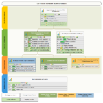
One way to understand what makes a great dashboard is to use a counter example of a poor dashboard. Here is an example of a poor dashboard design with several flaws:

- 3-D graphics that distracts from glanceability
- Borders use unnecessary colors and patterns
- Lack of filtered data
- Insufficient context and labels
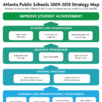
Here is an example of a high-quality data dashboard that is functional, glanceable, focuses attention on the important KPI’s of the organization and uses great design principals.

Back to our original question… Do you need a data dashboard? Here are a few signs that you do (and any one of these suggests that it might be time for your school district to complete a complete inventory of your data needs):
- You’re struggling to see all of your data in one location and have data scattered in various places.
- You’re monitoring and tracking data but you don’t know what to do with the information or how to make sense of it.
- Your data is lacking critical elements linked to KPI’s.
- You feel like your district can and must improve specific KPI’s but you are unsure of your current status.
- You have a current solution but it is not giving you the return on investment you need.
- You are lagging behind similar districts on important KPI’s.
- You are unable to look efficiently across multiple indicators.
- Your staff lack data literacy skills and knowledge.
- Your staff lacks the internal capacity to create a “homegrown” system.
by Chris Balow, Ph.D